


Wrights Jewellers is a long-established family business in Pukekohe, first opened in 1912 by Walter Wright. Our practice fitted this shop out in 1999 for his son, Gary Wright and 20 years later it was passed down to his daughter Rhian and her partner Ben Paul, who approached us to give it a whole new look to reflect a new generation taking over.
There was a desire to shift towards higher-end, trend oriented jewellery, whilst still reflecting on their personalised customer service and ability to create bespoke pieces with their in house jewellery manufacturer.
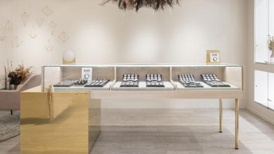
To hold on to the history of the shop the clients requested a number of wall and grandfather clocks to remain, but the old fit-out with its dark timber and navy carpeted floor had to go to make way for the new identity. The set of new jewellery displays counters we designed are open underneath to increase the sense of space in the store while decreasing the sense of separation between staff and customer.
Polished brass accents were used to reflect on the history of the shop, but updated with modern shapes and placement, complimented by the light ash timber-look laminate that was used for much of the joinery (as the budget wouldn’t stretch to real timber).
Soft greys used for walls, cabinets and drapery created a neutral base to highlight the timber and brass finishes, with the intention of creating a fresh and stylish setting that would still be inviting to the whole Pukekohe community.
Rhian and Ben were able to successfully manage much of the build themselves, using young, local contractors and cabinet-makers who finished their work to an incredibly high standard.
The project came in almost exactly on budget, a minor miracle given the size and scale of change accomplished. The result is delighted clients and a community of locals who now will use any excuse to come in to the shop and admire its fresh new look.
Photography by Sampford Cathie.


We created a more home-like environment with room sets and lifestyle displays, including a working demonstration kitchen. Circulation was clarified with a series of angled “Avenues” and “Lanes” enabling customers to navigate between and within departments. These departments were identified with different coloured flooring. The feature TV wall provides a drawcard to pull people deep into the store.
We positioned the electronics department to the front to draw customers through impulse offers and indicate leadership in this category, not just the furniture department the brand is best known for. A series of “Huts” hints at Canterbury’s architecture and act as signposts to key areas including the central service hub, which facilitates easy interaction between customers and staff.
The material palette was inspired by the brand’s Cantabrian heritage with the furniture area reflecting the colour of the hills, the electronics area indicates the patchwork of the planes, and the “Wets” (white-ware) area in the blue of the Pacific Ocean. Fittings were largely pine and ply to embrace the New Zealand building aesthetic and to show the “Value” nature of the brand.


As Wild Pair passed its 21st birthday, we and the client decided it was time for the store interiors to present a more elegant and mature variation of previous fitout models to reflect the increasing sophistication of the customers who have grown-up with the brand.
The aim was to keep the interior decoration low-key and neutral to create a more mature aesthetic and provide a soft backdrop to the merchandise. To achieve this we used a deliberately restrained decorations, minimal fixtures, framed posters, off-white painted surfaces, concrete floors and hand sanded cedar ship-lap lining for a deliberately ‘worn’ look.
The almost square corner site in the 277 fashion precinct (149m2) offered good visibility but very limited wall space, so to accommodate the necessary stock capacity. We used the 2 large window areas as both internal and external displays broken up with pine pigeon-holes to highlight different product displays.


R&G brand is aimed at a younger segment of the target market for Rodd & Gunn.
Working closely with R&G‘s visual merchandising director, we understood that the interiors depended heavily on the carefully chosen pieces of memorabilia and innovative merchandising presentation, so most of the fixtures are ‘found’ objects to give the feeling of a ‘Pop-up’ store.
The conventional fitout was limited to preserving the existing store’s shell and services, The shopfront was retained with a recoloured facade and a newly added timber door. Images by Derek Henderson and sketches by Wallace Ong.


Located amongst industrial warehouses and offering an unexpectedly fresh space on entry, the ‘Clothes Hangar’ is a head-to-toe styling and grooming experience for Air New Zealand staff which was conceived to “sell” the new Trelise Cooper uniform to them.
Encompassing the uniform and brand design direction with a nod to the swept-up eclectic Kiwi bach, walls of ‘V’ grooved panelling and floors of washed oak laminate provide the perfect backdrop to the blue tube racking that threads it’s way around the ‘shop’ and the fitting rooms.
The ‘check-out’ area is a bright pink counter with ‘graffiti’ print wallpaper and on leaving, staff are asked to write comments about their experience on coloured post-it notes to stick to the lobby walls.
The ‘Clothes Hangar’ won Gold at the 2011 BeST Awards in the Office and Workplace Environment category and featured in many highly regarded national and international interior design websites and publications. Image by Katrina Rees and Rebecca Swan.


Un Deux Trois is a new retail furniture and homewares store housed in the historic Le Quesne’s Pharmacy building in Ponsonby’s Jervois Road. Collaborating with our clients, we designed an interior where merchandise is grouped into ever-changing room ‘sets’ fitted around the column grid, resulting in a textured and colourful space in keeping with the eclectic and residential nature of their products.
The 162m2 retail space was in very poor condition, with no fire or sound proofing. The original floor had been largely removed and over-clad with particleboard. Most existing walls had been lined with GIB and the whole building sagged so much that parts of it fell by 300mm relative to others.
We exposed, restored and repainted the remaining original pressed-metal linings; sourced a similarly patterned wallpaper, over-clad the non-original shopfront with a new timber façade inspired by those typical of Paris’s Le Marais District. We also commissioned a mural of plants to decorate a non-original GIB wall. Images by Patrick Reynolds.


Redcurrents sumptuous fit-out is set in a warehouse space in Wellington. The brief for Studio Gascoigne was to provide backdrops of features to showcase the exquisite treats and treasures on display, bringing the brand into the next decade. A long entry ramp was made as the biggest challenge was to get customers to enter. The strong colour turned heads with an irresistible glimpse into Redcurrents world.
A series of dramatic spaces were created, using rich and enticing hues of gem-like pink which showcased the treasures. Colour and materials were inspired by the Redcurrent brand. Alluring pinks were used to add a sense of vibrancy, fun, and youthfulness, whilst appealing to a wide range of ages.
The shopfront windows glow day and night with a Hexaben honeycomb screen in translucent alluring pinks, and neon signage logo and blade sign. The dramatic entry wall of pink-on-pink stripes over mouldings, with traditional veranda post and balustrades, bring some quirks to this heritage detailing. Our client tells us that turnover has increased significantly, and customers are stopping in their tracks to enter.


Nosh Mt Eden is New Zealand’s largest of boutique supermarket chain and this store inhabits 825 square metres in an old furniture store.
Aiming at an “everyday shopping” experience which would undercut supermarket meat produce prices while delivering the freshest ingredients possible, we created a pared and back minimalist interior consisting of concrete floor and benches, exposed ceilings and industrial fixturings to highlight the product to its best.
Personality is introduced in the way of white tiles, timber accents and the Nosh signature black walls, which double as ‘specials’ blackboards. Nosh won bronze at the 2010 Best awards. Images by Emily Andrews.


Comvita challenged us to create a modular temporary kiosk format to be trialled in Auckland International Airport aiming specifically at the Asian health product market, displaying a wide variety of merchandise and graphics and reflecting the brand’s olive leaf and bee-product heritage.
The small site had poor site lines, a ceiling that couldn’t be modified and the need to lock up products after trading hours without any form of shutters or shop-front.
Our response was to design a kiosk more like a Pop-up market stall, deliberately encouraging customers to walk through the store without feeling trapped. A series of units resembling beehives were installed seemingly at random to create an organic browsing experience, with hinges to lock against each other for after- hours security. The store has consistently traded in excess of budget
Faux ‘weather-aged’ timber was used for flooring and counter tops to foster an authentic feel and lighting ‘floats’ below the existing ceiling. The various joinery units are reconfigurable for use at other sites. The result is a space markedly different to anything else at the airport, that breaks the mould of a typically mono-chromatic, sterile looking health and beauty offer in an area of high transit. Images by Patrick Reynolds.