Storefront design is the planning of everything people see from outside a shop: the facade, signage, windows, entrance and lighting, so that a passer-by understands the business and wants to walk in. A good shop front is easy to spot, shows what is inside and makes the first step through the door feel easy. This guide covers the parts of a storefront, how to design one, and lessons from shop fronts Studio Gascoigne has designed across New Zealand.
Key Takeaways
- Let people see inside: a hidden interior is the most common reason a shop front fails.
- Light the front so it works at night as well as by day.
- Make the entrance easy and inviting, especially where the shop sits back from the street.
- Use colour, signage and shape that match the brand and can be seen from a distance.
- Treat the windows as displays that face both the street and the shop floor.
- On heritage buildings, restore or replicate the character instead of hiding it.
What Is Storefront Design?
Storefront design, or shop front design, covers the outside face of a shop and the threshold into it. It includes the facade and fascia, the signs, the window glazing and displays, the door and entrance, awnings or canopies, and the exterior lighting. It is the first part of the retail store design a customer meets, and often the part that decides whether they come in at all.
The Parts of a Storefront
| Element | What it does | Example from our projects |
|---|---|---|
| Facade and fascia | Sets the character and carries the name | A new timber facade inspired by Paris at Un Deux Trois, Ponsonby |
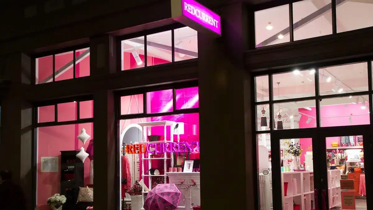
| Signage | Tells people who you are, from a distance | A neon logo and blade sign at Redcurrent, Wellington |
| Windows | Show what is inside and display product | Two large windows used as displays both ways at Wild Pair |
| Entrance | Makes the step inside feel easy | A barn-like, open shopfront at Icebreaker, Auckland Airport |
| Lighting | Keeps the front visible day and night | An illuminated frontage at Hayama, Auckland Airport |
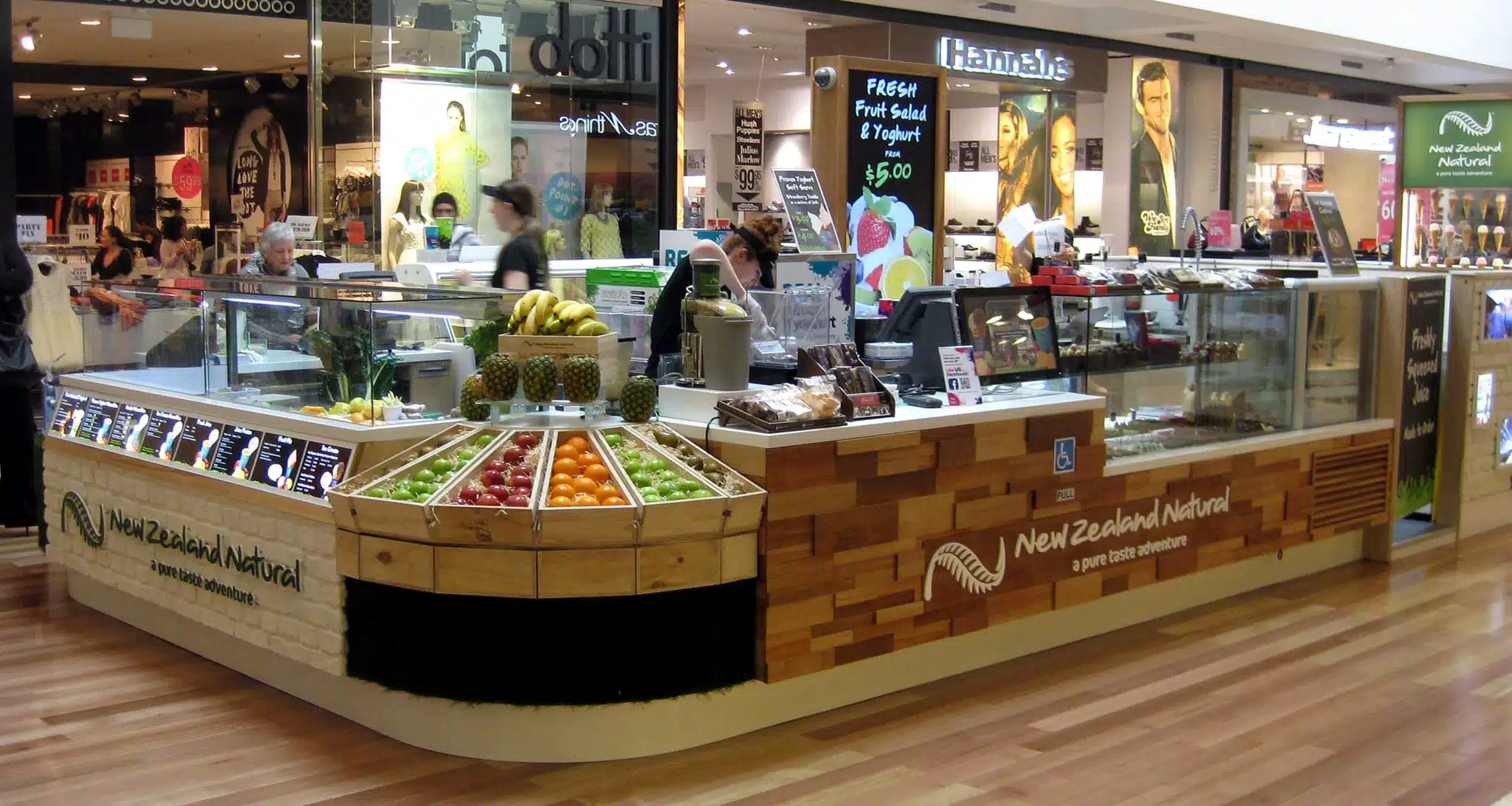
| Awnings and canopies | Add shape and colour, easy to spot | Striped awnings on the New Zealand Natural kiosk, Henderson |
How to Design a Storefront That Attracts Customers
- Find the main problem. Ask why people walk past. At Redcurrent in Wellington, the biggest challenge was simply getting customers to enter.
- Check what people can see. Stand across the street and look in. At Cali Press in Graham Street, semi-mirrored glass hid the interior almost completely.
- Know the building. Heritage, landlord and site rules shape what you can change. Some sites allow only a recoloured facade and a new door; others allow a full new face.
- Choose the signs and where they go. Plan a main sign for the street and a projecting or blade sign for people walking along the footpath.
- Plan the lighting. Light the windows and signs so the front still works after dark.
- Design the entrance. Make the door and threshold easy to find and inviting to cross.
- Match the brand. Use the brand’s colours and materials outside as well as in, so the front tells the same story as the store.
Storefront Design Ideas From Real NZ Shops
Make the front glow: Redcurrent, Wellington
Redcurrent sits in a warehouse space in Wellington, and the brief’s biggest challenge was getting customers to come in. The studio made a long entry ramp and used strong colour to give passers-by a glimpse into the brand’s world. The shopfront windows glow day and night with a translucent pink honeycomb screen, with a neon logo and a blade sign. The entry wall of pink-on-pink stripes, with a traditional veranda post and balustrades, plays on the heritage detailing. The client reports that turnover has increased significantly and that customers stop in their tracks to come in.
Open up the front: Icebreaker, Auckland Airport
Icebreaker’s flagship in the international terminal at Auckland Airport is aimed at departing tourists. The store is narrow, so the Icebreaker shopfront is deliberately barn-like and open, letting customers fall easily into the space. Natural materials such as New Zealand pine, stone tiles and real barn wood evoke New Zealand’s environment, and the studio describes the store as much a billboard for the country as a shop.

Give an old shop front a new face: Un Deux Trois, Ponsonby
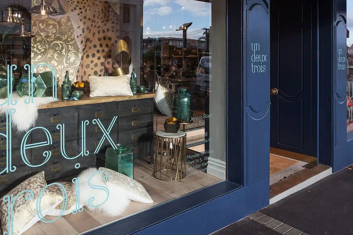
Un Deux Trois is a furniture and homewares store in the historic Le Quesne’s Pharmacy building on Jervois Road. The existing shopfront was not original, so the studio over-clad it with a new timber facade inspired by the shop fronts of Paris’s Le Marais district.
A new face does not always mean a rebuild. For R&G in Newmarket, the shopfront was kept, with a recoloured facade and a new timber door. At the Hallensteins Queen Street flagship in the historic Lewis Eady building, most original shopfront features had been lost, so the studio worked with Heritage New Zealand to retain and replicate as many historic elements as possible.
Fix a hidden interior: Cali Press
At Cali Press on Graham Street, the existing semi-mirrored windows made the interior very hard to see from outside. The studio added shop-front signage to make the inside more visible, and the owners keep the doors open most of the time so people can see what is happening inside.
Be seen from a distance: kiosks and airports
A kiosk or concourse shop has no street front, so it has to stand out in a crowd.
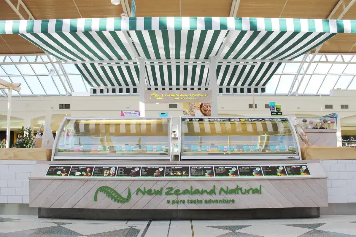
- Shape and colour. Green and white striped awnings give the New Zealand Natural kiosk at WestCity Henderson a market-stall feel and make it easy to spot across the concourse.
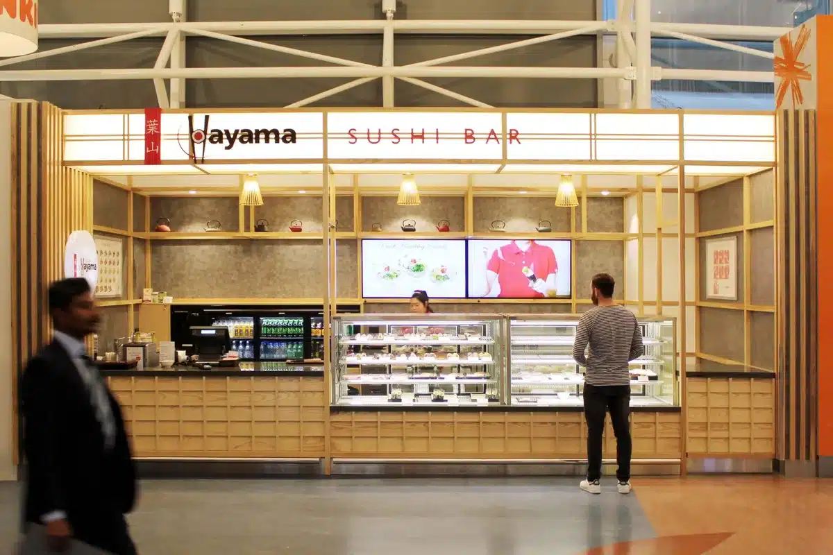
- Light. The Hayama sushi bar at Auckland Airport sits near the end of a long concourse, so the clients wanted the frontage illuminated and as eye-catching as possible.
- Signs where none were planned. Another Hayama site had no exterior walls and was hard to identify from a distance, so the studio persuaded the airport to allow signage on the front of an existing column.
- Plain words. At Kiwi Discovery, signage had to be explicit for often hurried customers who do not speak English.
Shop Front Signage Ideas
- Neon and blade signs. A neon logo plus a projecting blade sign catches people walking along the footpath, as at Redcurrent.
- Light boxes. At Halong Bay, a Vietnamese food outlet at Auckland Airport, light-box signs recall Vietnam’s street market and food store signs, with neon adding to the effect.
- Illuminated bulkheads. At Hayama’s domestic airport store, a lit bulkhead over the counter made a corner site more visible and lit the work surface below.
- Typography that reads at a distance. Keep lettering simple, large and in the brand’s own typeface, so the name reads from across the street and matches the store inside.
- Signs that reveal the inside. At Cali Press, shop-front signage helped make a hidden interior visible.
Small Storefront Design
Small storefronts have to work harder. At Wild Pair, a near-square corner site of 149 square metres in the 277 precinct had good visibility but very little wall space, so the two large window areas became displays for both the street and the shop floor, broken up with pine pigeon-holes. Keep the glass as clear as you can, let the window display double as stock space, and let the sign carry the brand.
Window Displays
The windows are where the storefront and the store meet. We cover dressing them, themes and changing displays in our visual merchandising guide, and lighting them in our retail lighting tips.
Working With a Storefront Designer
A storefront works best when it is designed with the interior behind it, so the outside makes a promise the inside keeps. When the design is done, our guide to selecting a shop fitter covers the build, and our showroom design guide covers larger format stores.
Planning a fit-out?
Tell us about your site, timing and brief. Studio Gascoigne designs retail, hospitality and workplace interiors across New Zealand.
Storefront Design FAQs
What is storefront design?
Storefront design is the planning of everything a passer-by sees from outside a shop: the facade, fascia and signage, the windows, the entrance and the lighting. Its job is to tell people what the business is and make them want to step inside.
What makes a good storefront?
A good storefront is easy to spot, shows what is sold at a glance, and lets people see inside. A clear sign, lit windows and an open, inviting entrance do most of the work. At Redcurrent in Wellington, glowing windows and neon signs had customers stopping in their tracks.
How do you make a shop front stand out?
Use light, colour and shape that match the brand. Illuminated signs and windows work day and night, a strong feature colour turns heads, and details such as striped awnings or a distinctive facade make a shop easy to find from a distance.
How do you design a small storefront?
Keep the glass clear so people can see in, use the windows as displays for both inside and outside, and make the sign do more work. At Wild Pair’s corner store, two large windows served as displays facing both the street and the shop floor.
Do I need permission to change my shop front?
Often, yes. Changes to a facade, signage or a heritage building can need landlord approval, and some need council consent. Check with your landlord and your local council before you commit to a design, especially for a listed or character building.
Top photo: Redcurrent, Wellington. Sources: Studio Gascoigne project pages for Redcurrent, Icebreaker, Un Deux Trois, R&G Newmarket, Hallensteins, Cali Press, New Zealand Natural, Hayama, Kiwi Discovery, Halong Bay and Wild Pair (checked November 2026).